
Comic Sans is 30 years old. This font, which has garnered a mix of widespread use and intense dislike, is the subject of a new book by Simon Garfield. Comic Sans is one of the most utilized and simultaneously criticized typefaces in the digital era. How did it come to be? What led to a movement to ban it while it remains popular among educators? What does its unintended creator think about its controversial and unique history?
A concise and delightful history of the font we love to hate, by the New York Times best-selling author of Just My Type.
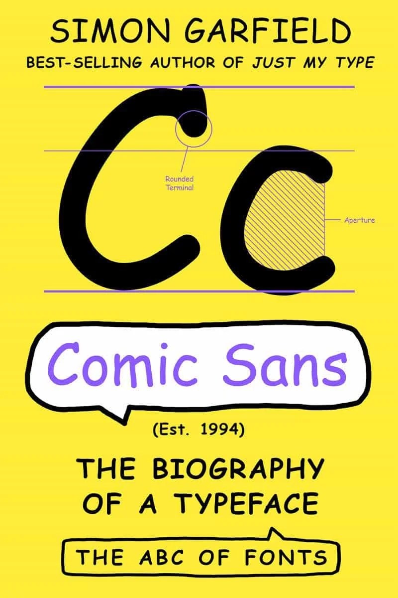
Comic Sans: The Biography of a Typeface tells the fascinating story of how Comic Sans originated from speech bubbles in educational software to become one of the most recognizable — and reviled — typefaces globally. This quirky and distinctive book explores how the advent of the computer revolutionized typography, making it accessible for anyone to use and critique. It delves into how a typeface, when used appropriately, can effectively market nearly anything.

Using the font Comic Sans for the first time is akin to playing “Smoke on the Water” on a guitar for the first time. Just as the iconic riff of “Smoke on the Water” is a simple yet thrilling milestone for novice guitarists, experimenting with Comic Sans brings a sense of novelty and excitement to beginners in design. Both are often initial forays into their respective fields, representing an accessible entry point that sparks creativity and engagement, despite being met with mixed reactions from more experienced practitioners.
The playful, rounded font of Comic Sans has become widely recognized for its use in poorly designed children’s party invitations, misspelled emails, and passive-aggressive PowerPoint presentations.

Vincent Connare, who created Comic Sans in 1994 for a product called Microsoft Bob, defends the font against its critics. He argues that those who express disdain for it “don’t understand what it is to make typefaces; they don’t realize that it’s not a personal taste thing. You need an audience, a client, some purpose to make it.” Connare emphasizes that the creation of a typeface is driven by its intended purpose and audience, not just individual preferences.

The book concludes with a thought-provoking question: could Comic Sans now be considered the coolest typeface ever made?
Discover more from Sandbox World
Subscribe to get the latest posts sent to your email.
Be First to Comment